The Problem & Solution
At the time of this design, Wheel World's website was difficult to use and frustrating to shop on. Information on products and store specials were blending into each other, creating confusion and ultimately being overlooked. The objective of this project was to redesign the user experience to allow for better accessibility of their products and promotions.
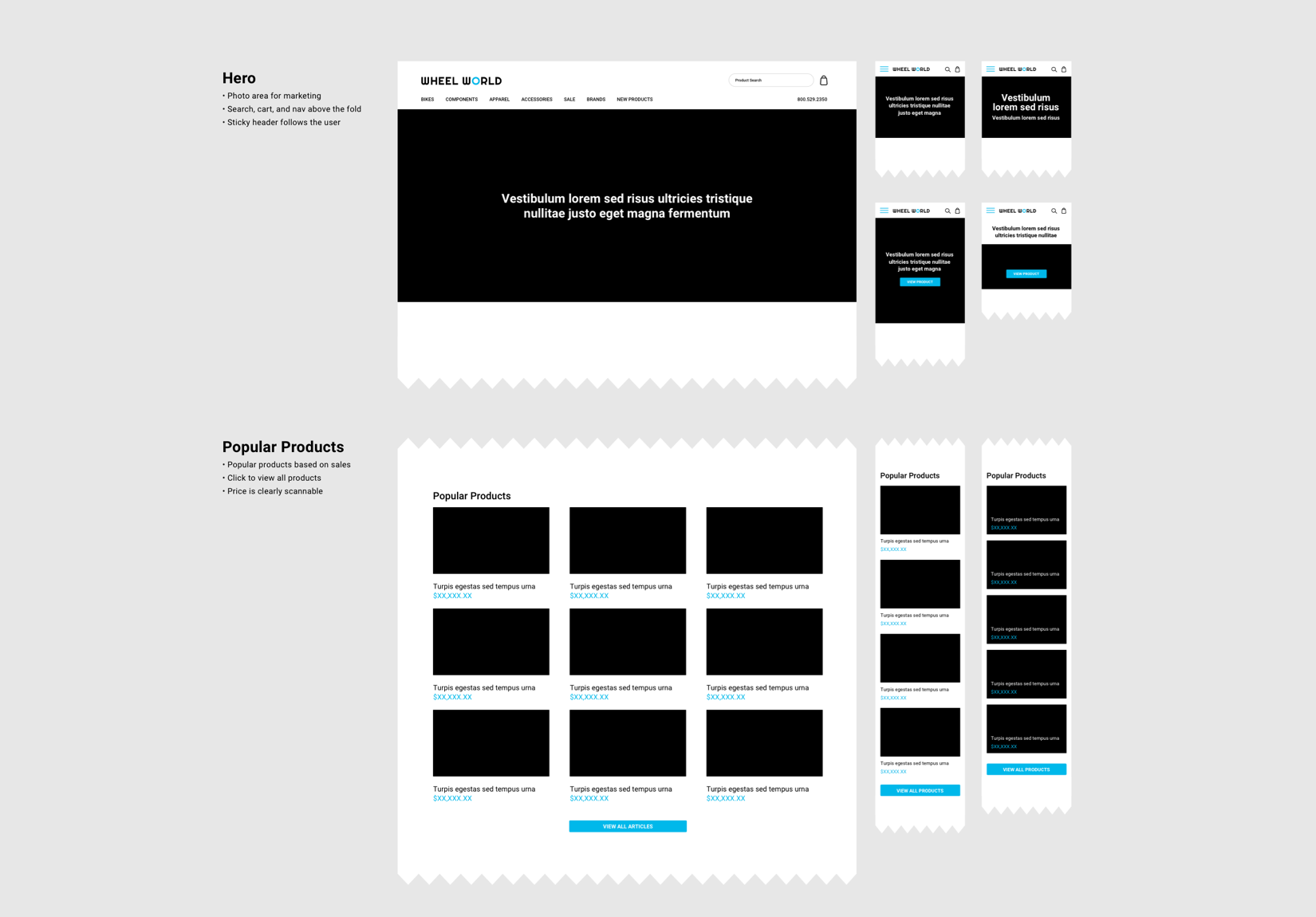
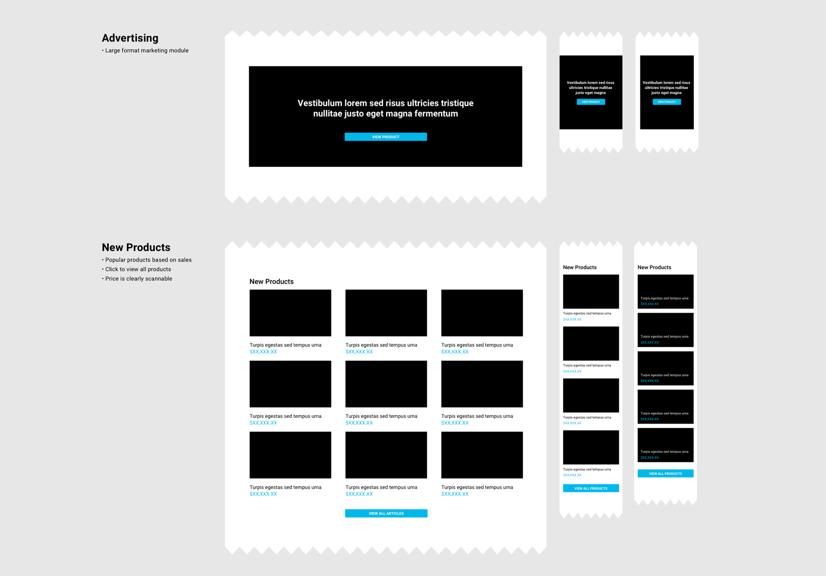
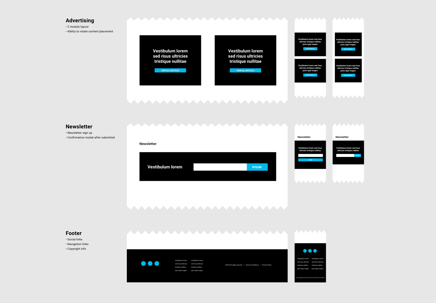
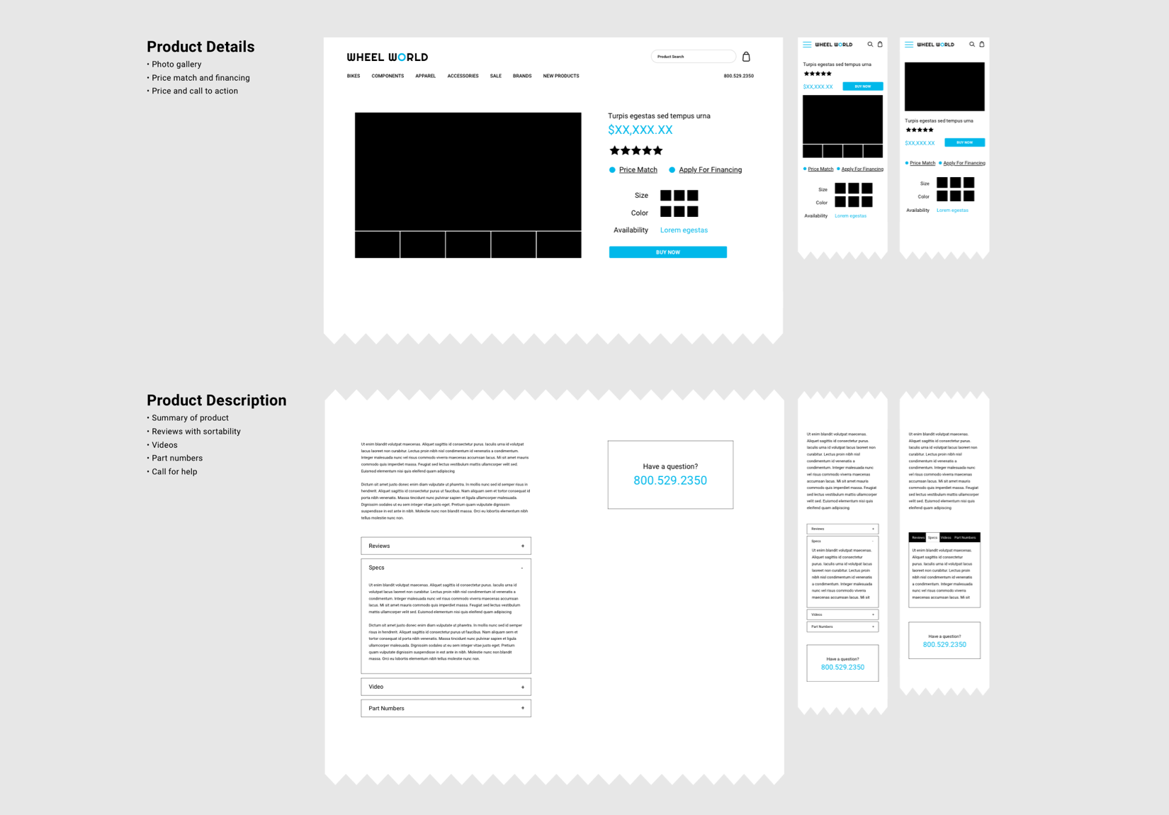
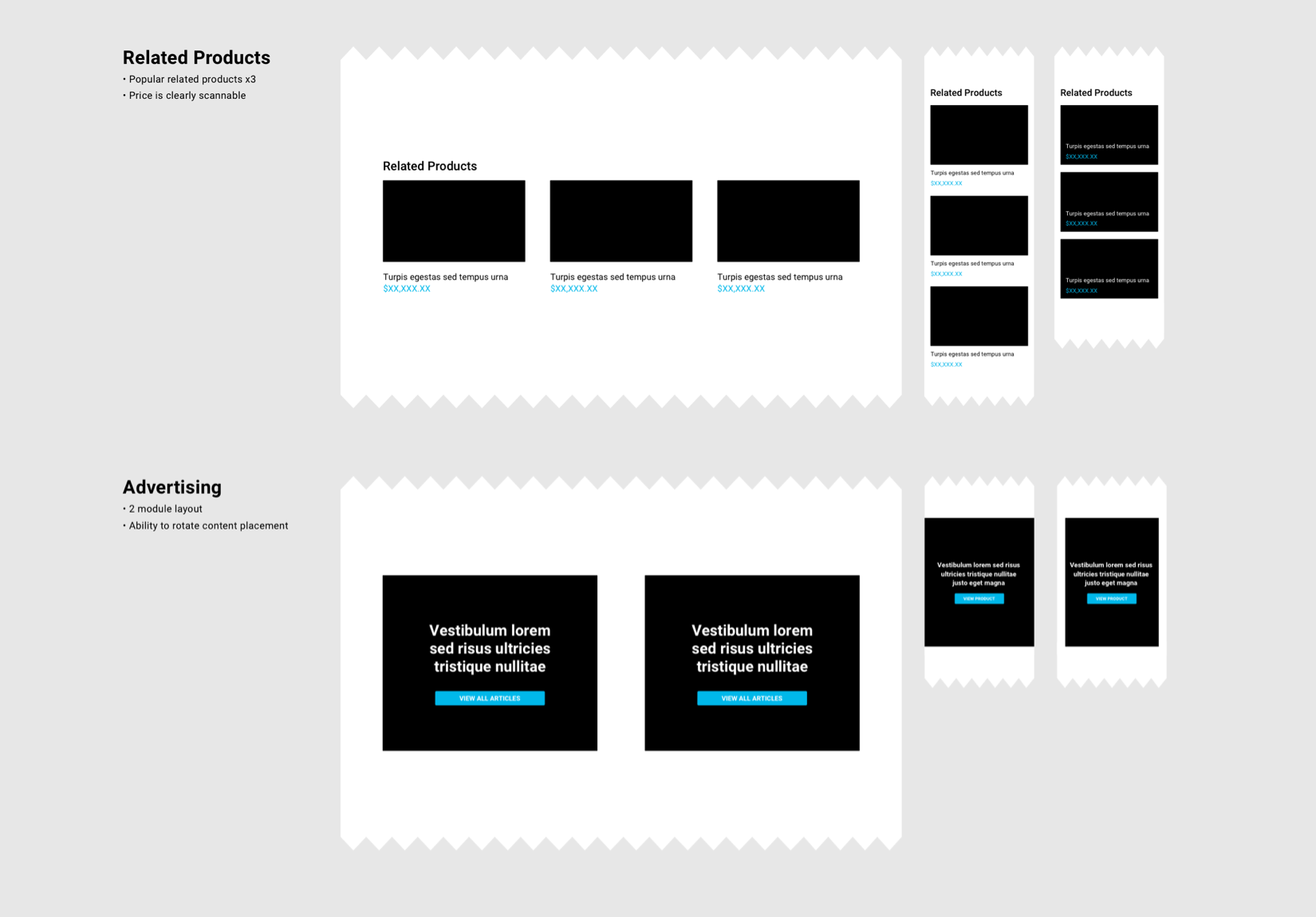
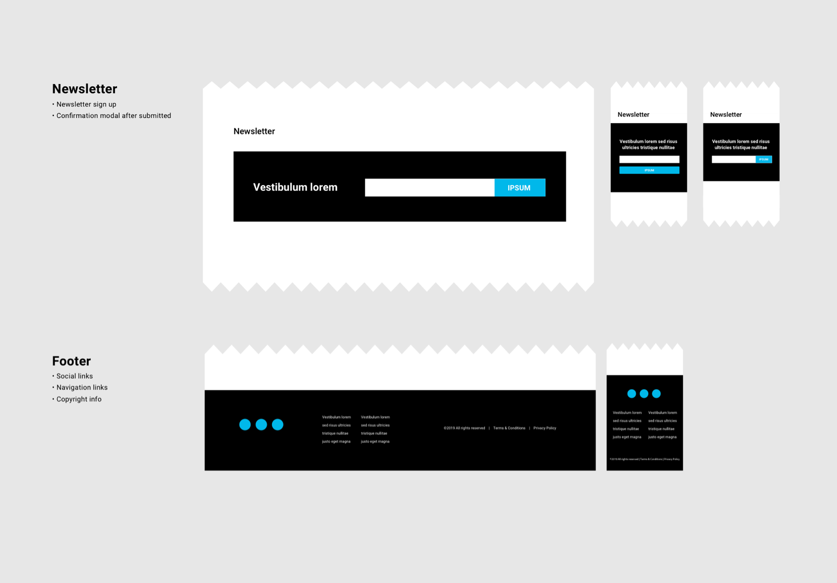
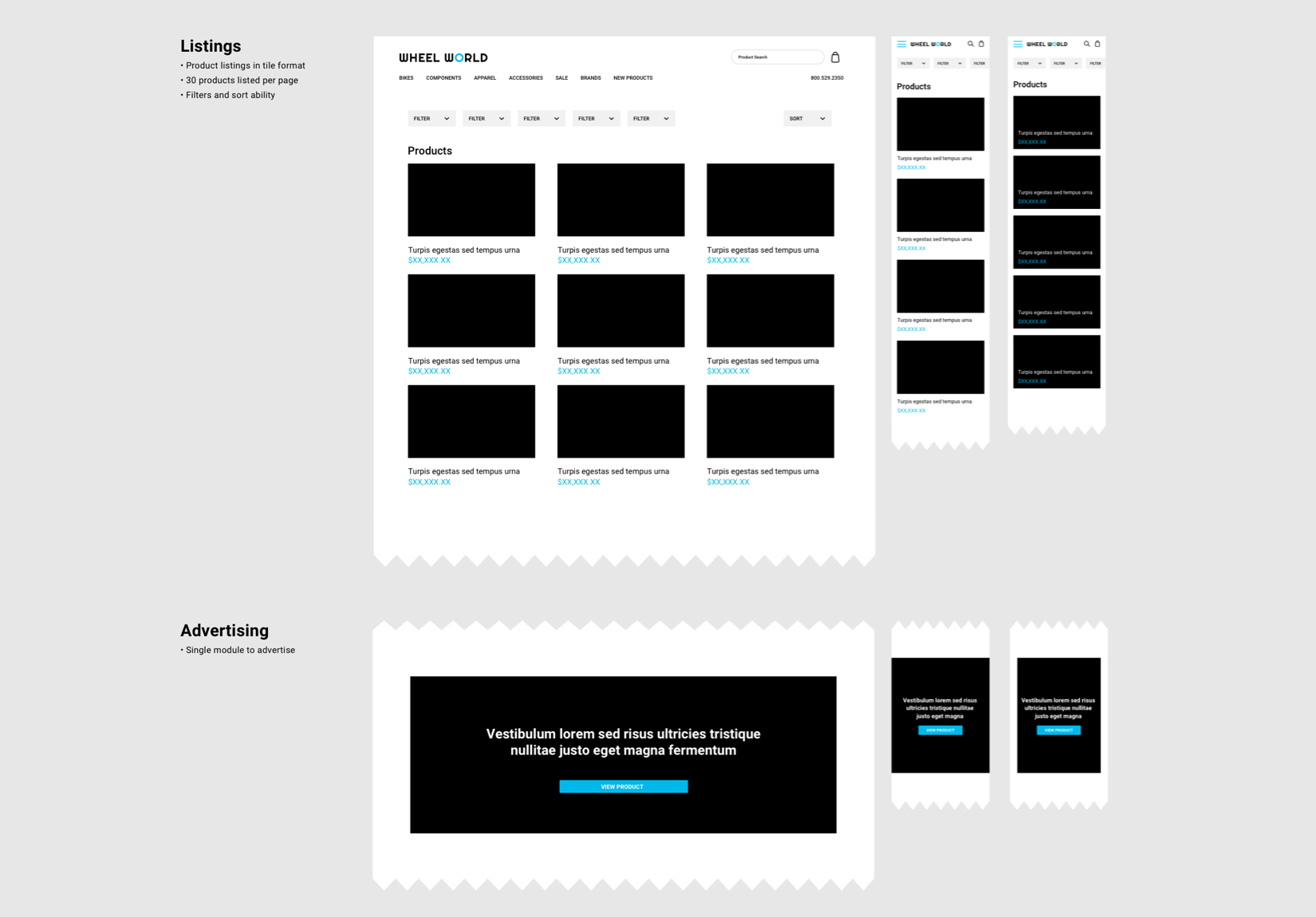
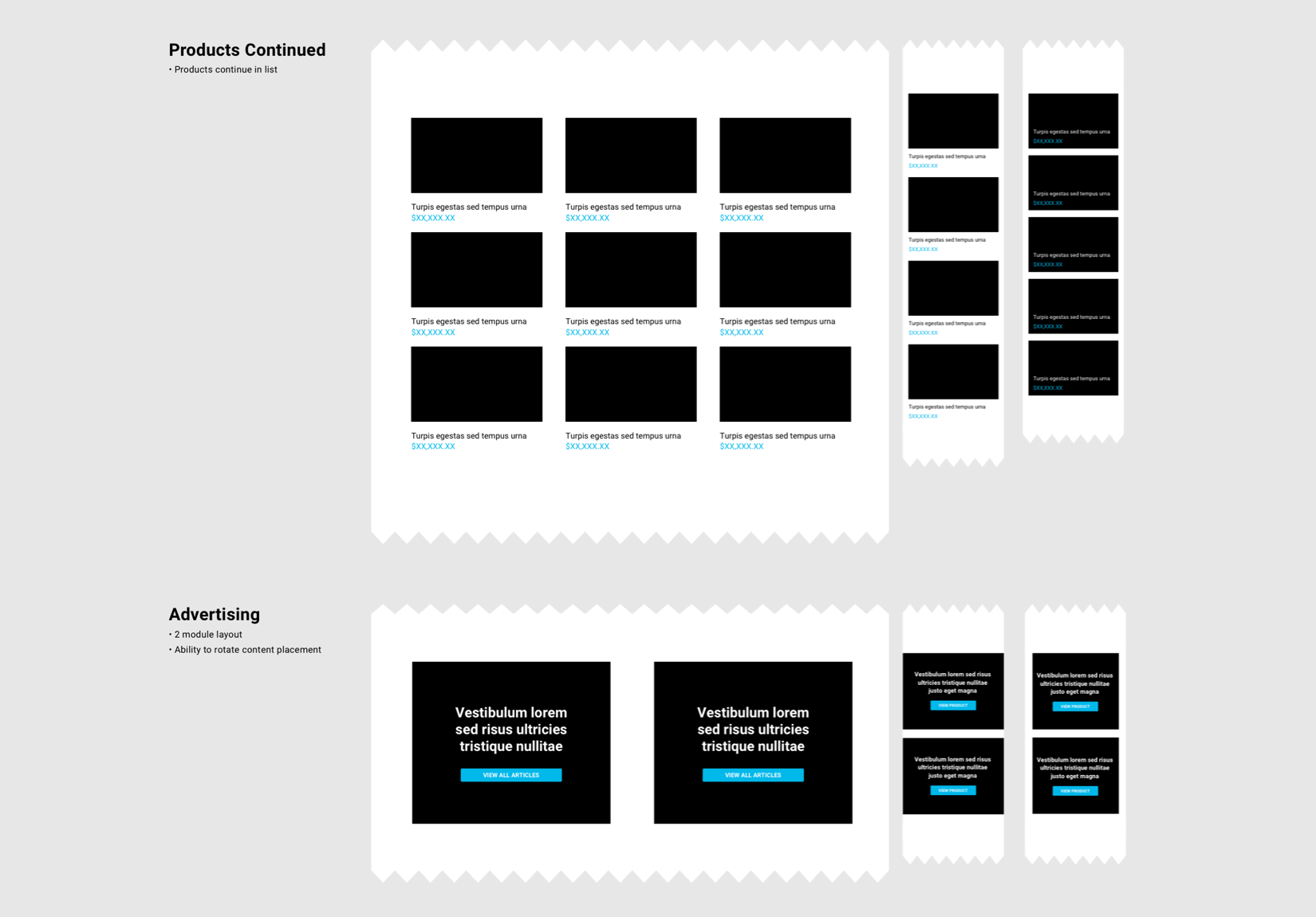
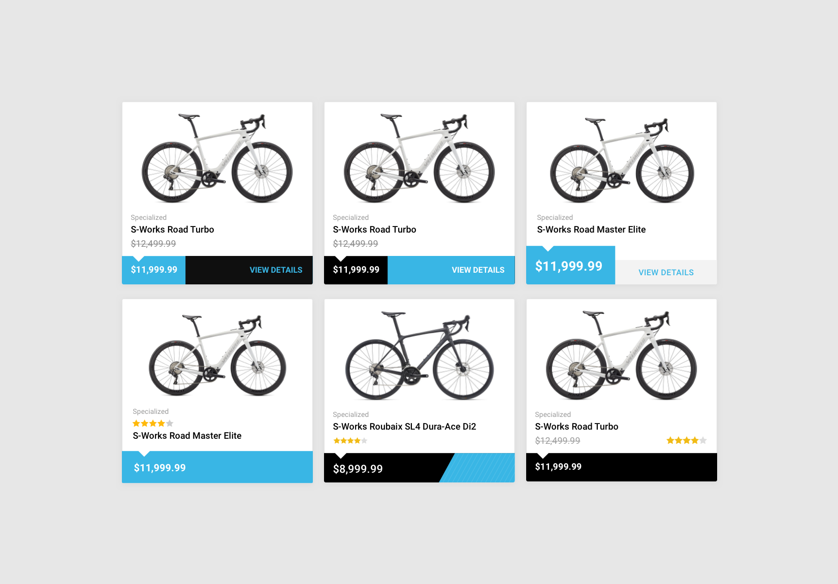
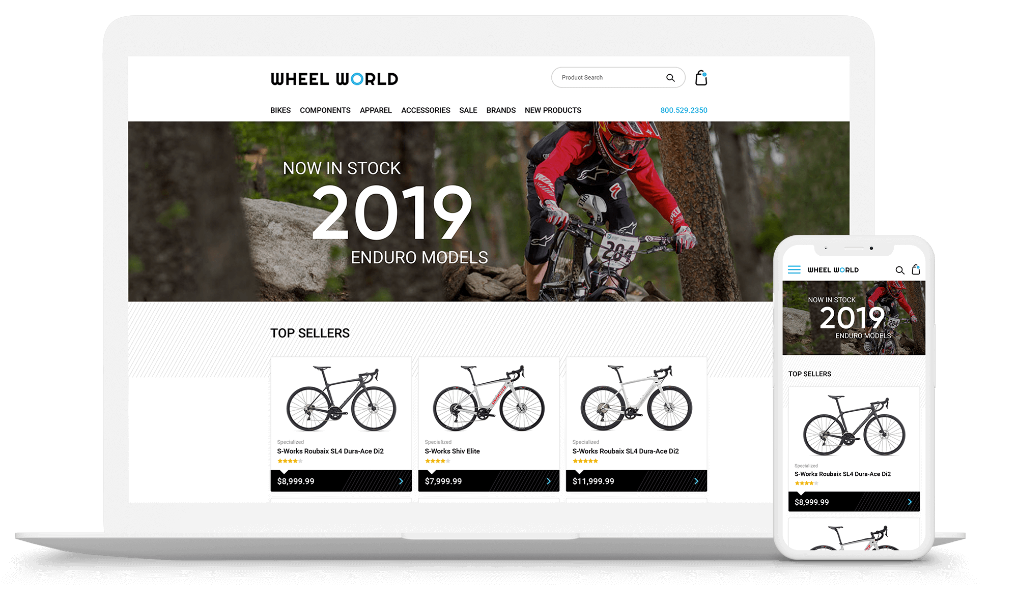
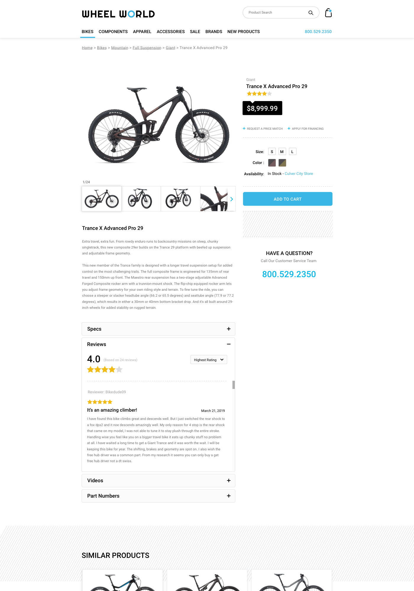
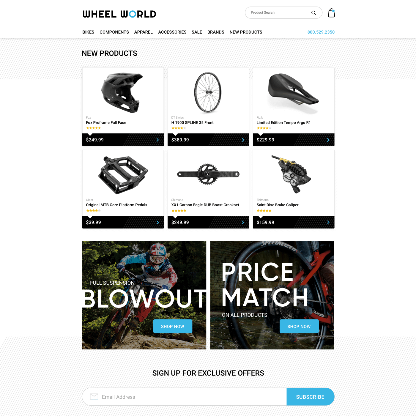
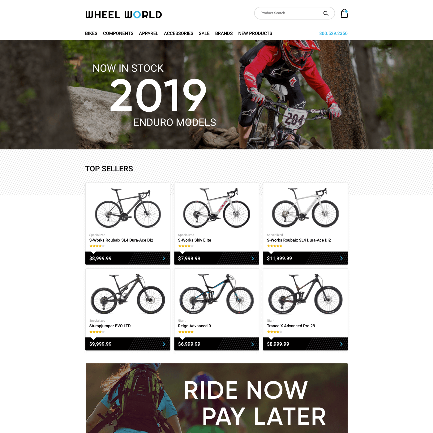
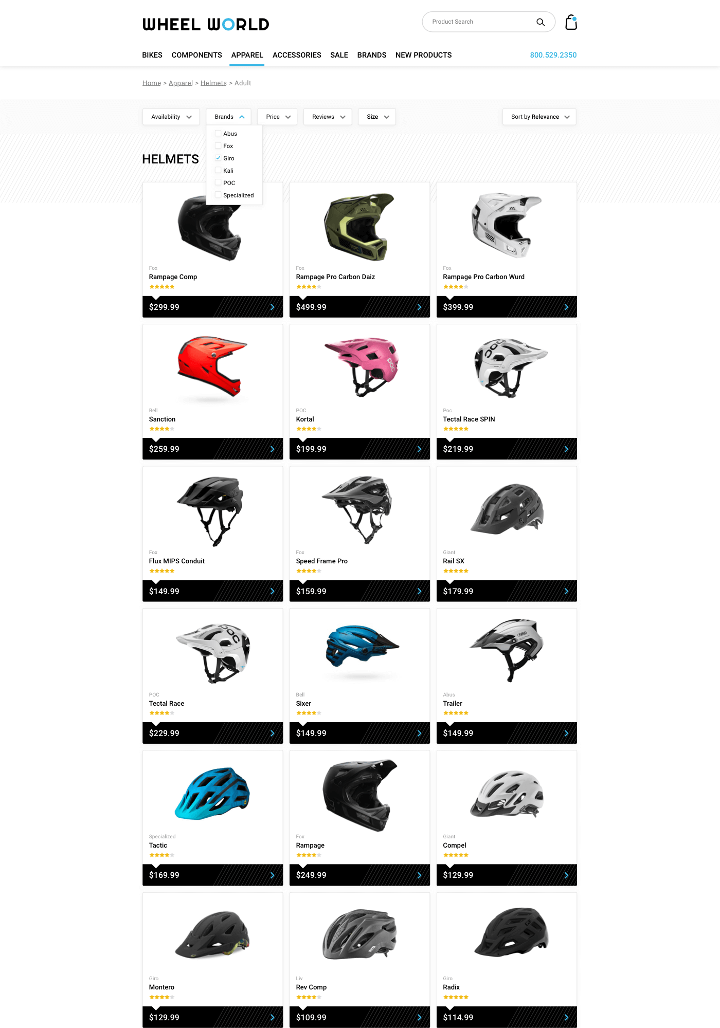
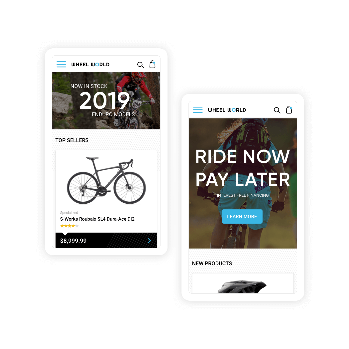
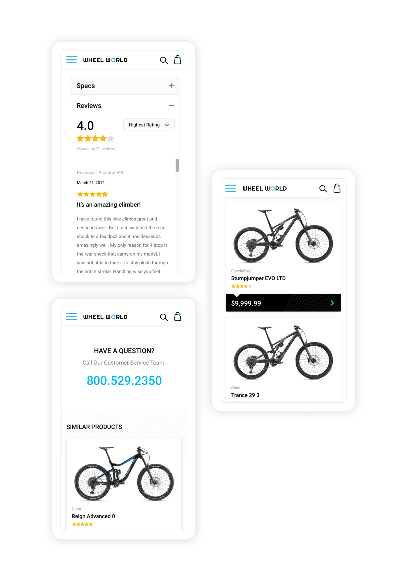
A new grid-based layout places the important product information into easily accessible locations, creating natural separation between each content module and allowing easy scanability across the site. Standardized content modules were also created to help raise awareness of their limited-time promotions and new product launches.

The Process
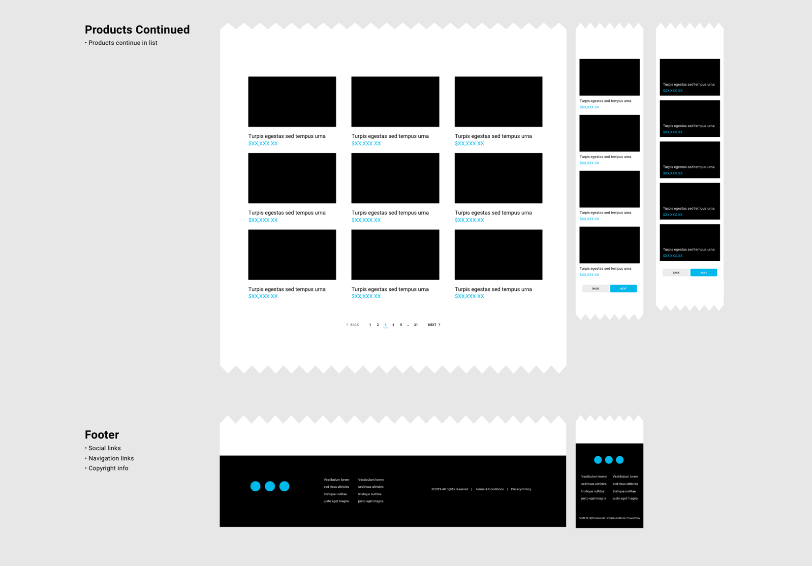
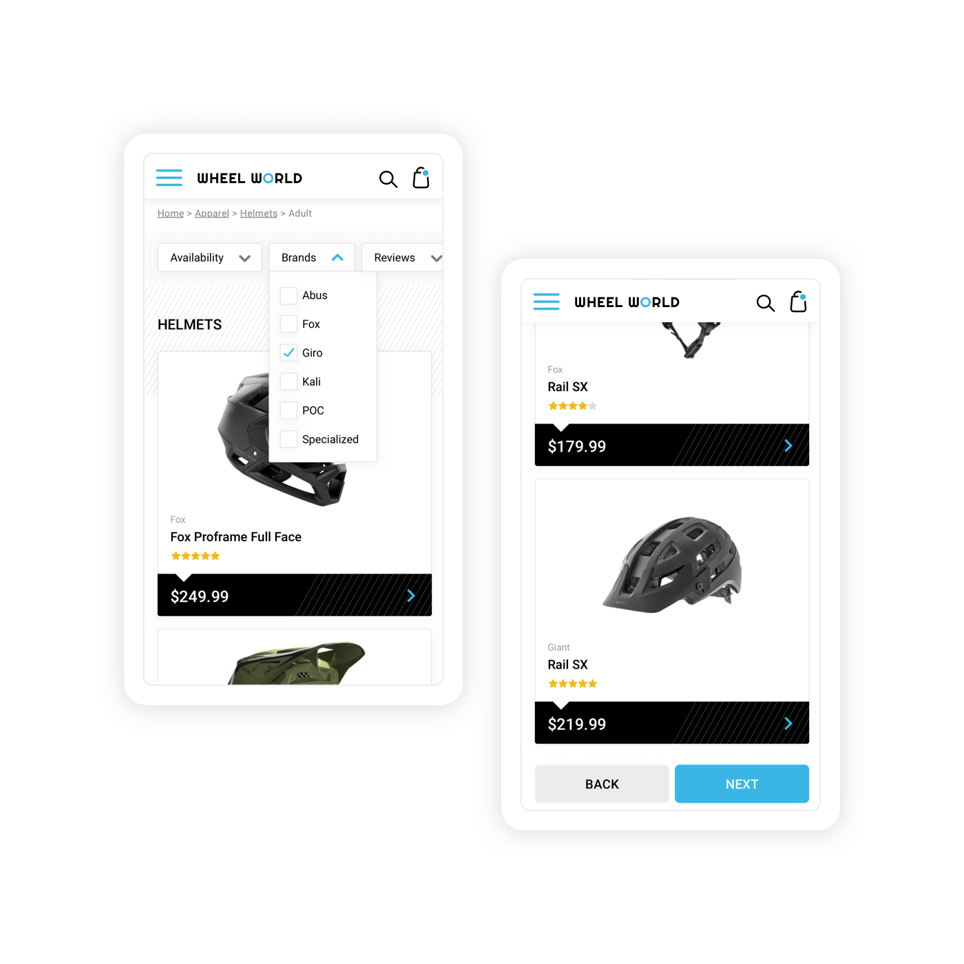
Wireframes were the very beginning of the Wheel World redesign. A sincere need for structure and the ability to absorb information was required and made the point of this project. I explored layouts that helped drive more attention to products and special services while ensuring the site would properly respond to mobile devices. In order to achieve this, it was apparent that I needed to break content into cards and establish a visual hierarchy among the various groups of information.